Exponents
Nonprofit branding
Exponents, celebrating over 35 years, is a community-based, non-profit organization dedicated to helping individuals suffering from the effects of substance abuse, HIV/AIDS, and the recently incarcerated. The programs they offer are a synthesis of therapeutic community classes and low threshold principles that engage and retain clients in services. They are designed to support successful life transitions for the neediest of New Yorkers by empowering individual responsibility in an inspiring community setting. I had the rare privilege of rebranding such a radical and progressive company whose values I could really stand behind.
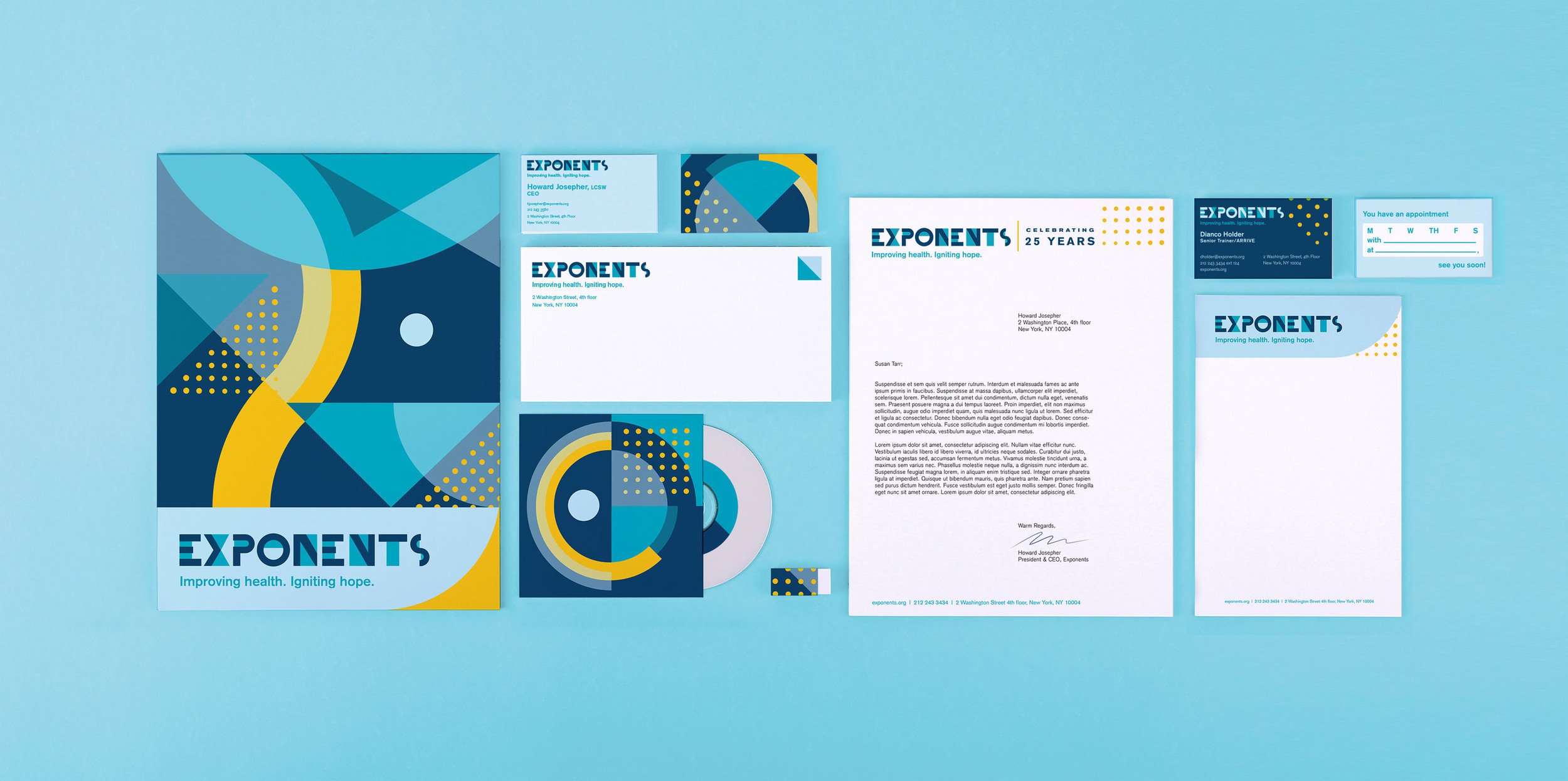
When I took a tour of their offices, I was introduced to a class in the middle of a lesson, and was overwhelmed by the palpable positivity and happiness that filled the room. I wanted their new look to evoke that same feeling. The new Exponents system is as jazzy, flavorful, diverse, and joyous as their clientele. The Exponents program tenets are about embracing your imperfections, and finding ways to "make it work" both in individual and group settings. I utilized a series of geometric pieces that initially, may seem abstract, but ultimately fit together to create something greater than itself.
Different teams have different needs.
I designed a few variations of business cards based on the organizations different needs. The senior staff received cards with a dark color-way on the front and the standard pattern on the backs that all wove together like a patchwork. Employees at The Center, Exponents’ for-profit sector, received cards with a light blue colorway. The outreach team is a group with boots on the ground who go into different communities in search of those who might need services. This group benefitted from appointment reminders on the back of their cards, rather than the patchwork pattern.
The Mobile Unit
Exponents has a mobile unit that, staying true to the organizations core tenet, meets people where they’re at. This van travels around to neighborhoods throughout the five boroughs of NYC performing free HIV and Hepatitis-C testing. When laying out the brand elements, I wanted to work with the curvature of the van and organize the information clearly and cleanly. You can follow the movements of this van at @gettestednyc.


